
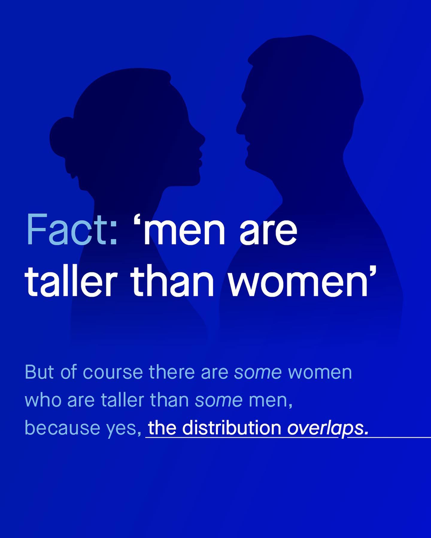
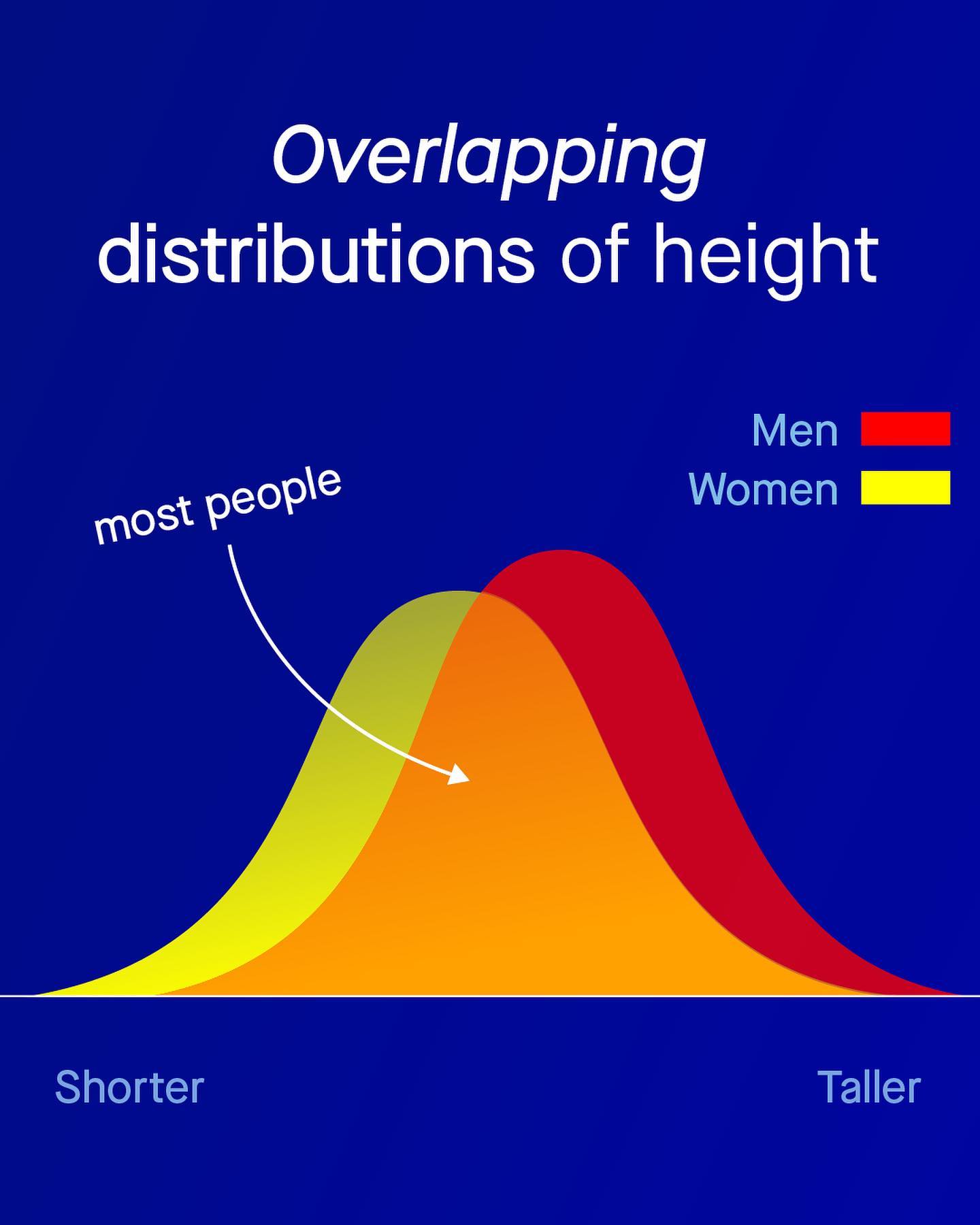
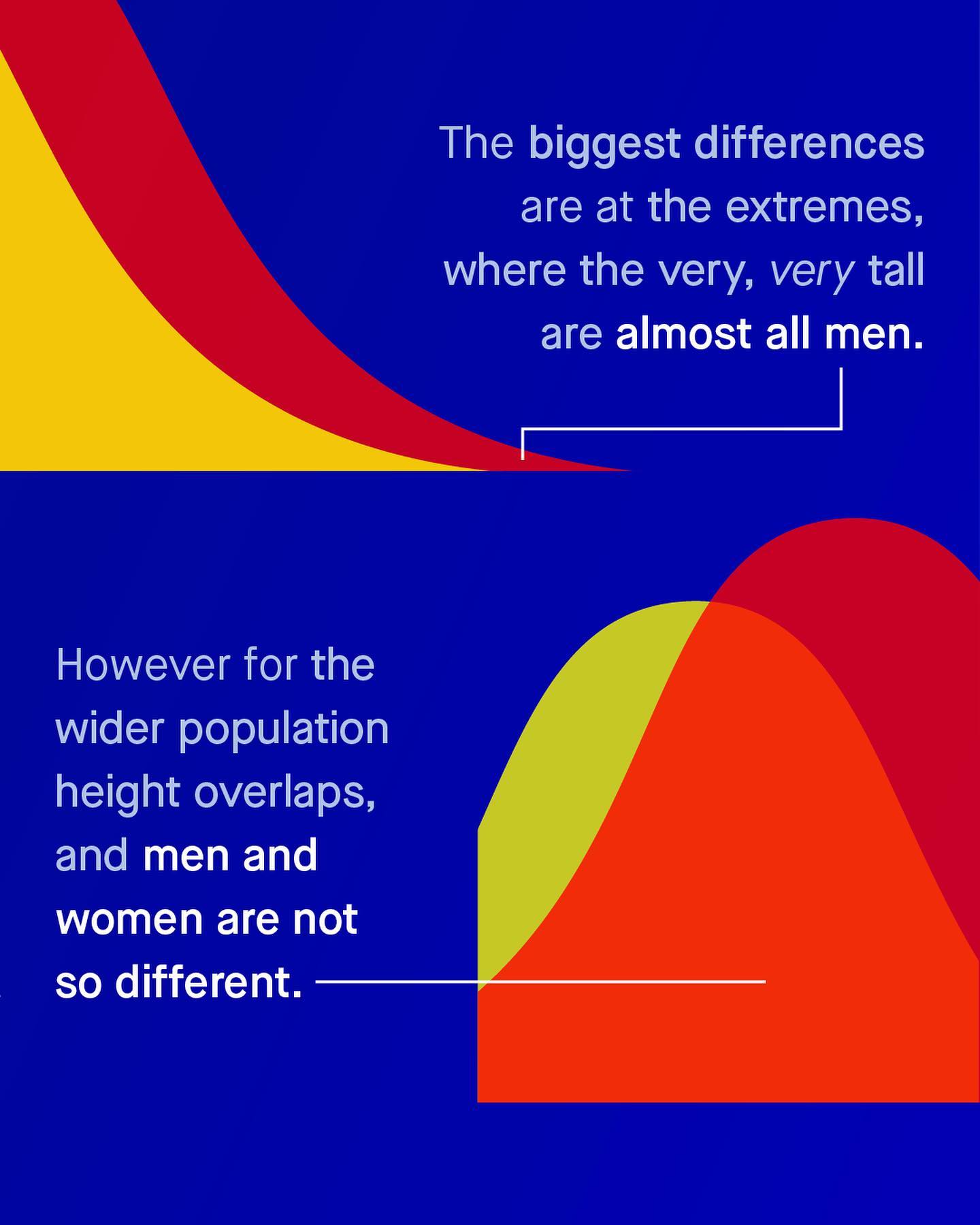
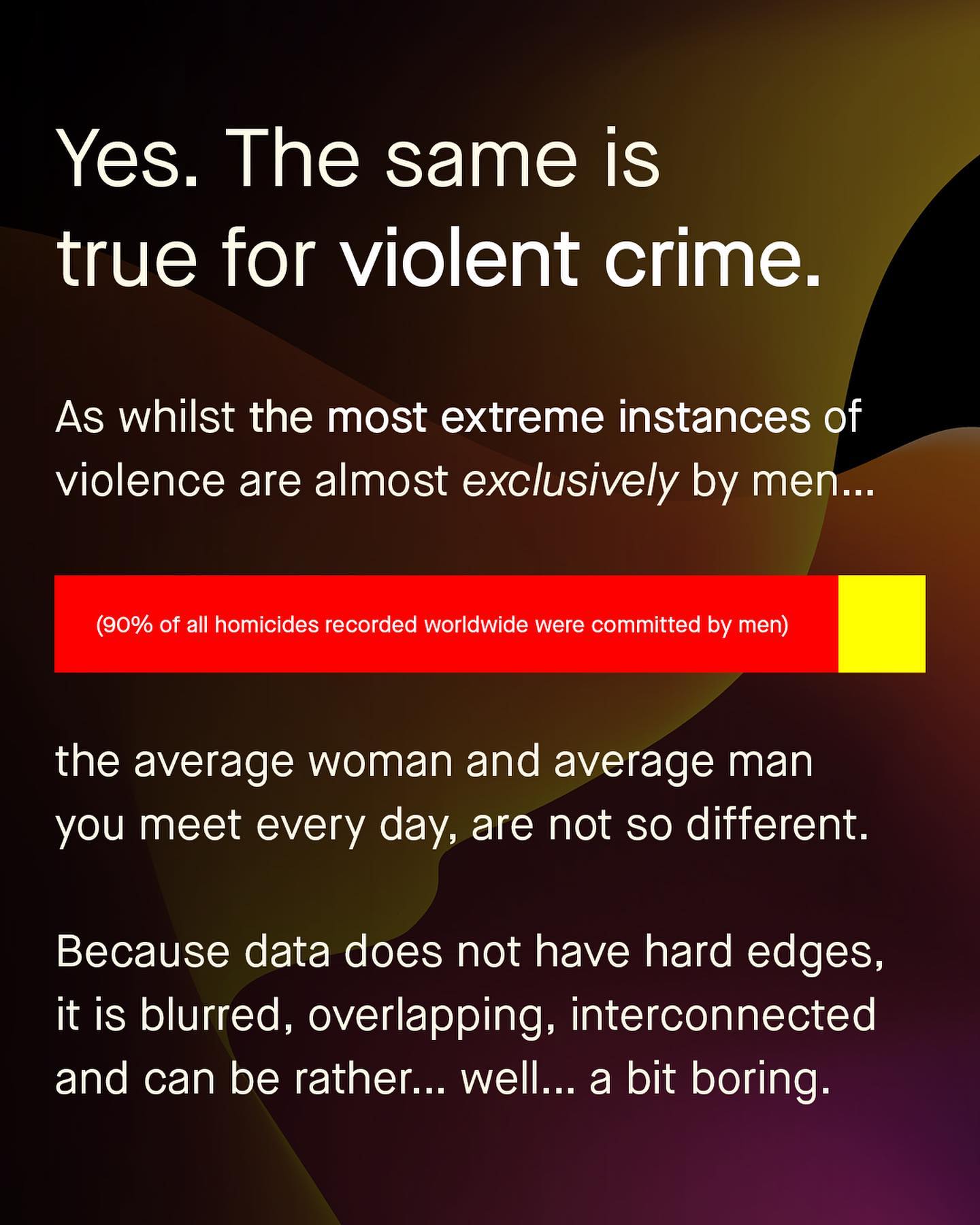
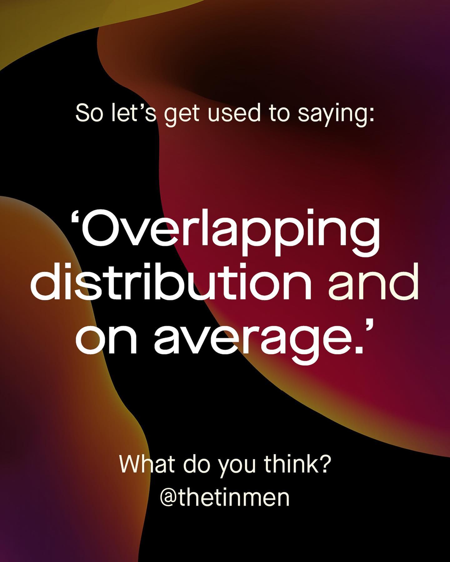
Complex answers do not fit into tiny glowing squares, held in your hands. I would know. I’ve been trying to overcome these restrictions for years now. For data is complex, nebulous, expansive and contextual. Too often it is boiled down into simple graphics – coloured bars, and beautiful pie charts, with hard and well defined edges, and chiseled corners. But as human beings we do not work quite like this. So when I suggest ‘maybe women are less interested in engineering’, I do not mean every woman hates engineering. I mean, in general, women might be less interested in engineering than men are on average, and the distribution overlaps. God damn that is wordy. I also write often about ‘boys being behind at school’. And with that, of course I understand that some boys are ahead, and some girls are behind. But again, I’m talking about ‘overlapping distributions and on average’. Even writing that was tiresome. Are you bored yet? Because that’s the problem. Conversations get reduced down to their most exciting extremes, and nowhere is this more clear or misleading, than in the discussion of violent crime. We see that 90% of murderers are men, and we somehow apply that to the entire population of ‘all men.’ Now seemingly men are all murderers, and all dangerous, and to be avoided at all costs. But is that an honest analysis of the data? So let’s take a look at how a more detailed, albeit still imperfect insight, can tell us a little more about the hidden nuance of statistics. ~ Images by Vidar Nordii Mathisen, Gilles Lambert, Kenny Eliason, and Nordwood Themes from Unsplash. Illustration by José Manuel de Laá from the Noun Project.
2022-10-20